Background
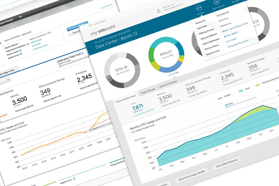
This is the company’s first on-demand cloud service dashboard. This page has complex data of current and historical usage metering, spending trend, as well as lot of payment, alert, user info. There are also many flows that initiated from this page for users to manage this service. I got the project after the first user study of the draft wireframe.
My Mission
Focus on users needs, create better experience and inovative data visualization
My Approaches
- Make improvement one step a time
- Provide practical solutions based on current system and style for current release
- Think out of box for the next generation release
Design Process
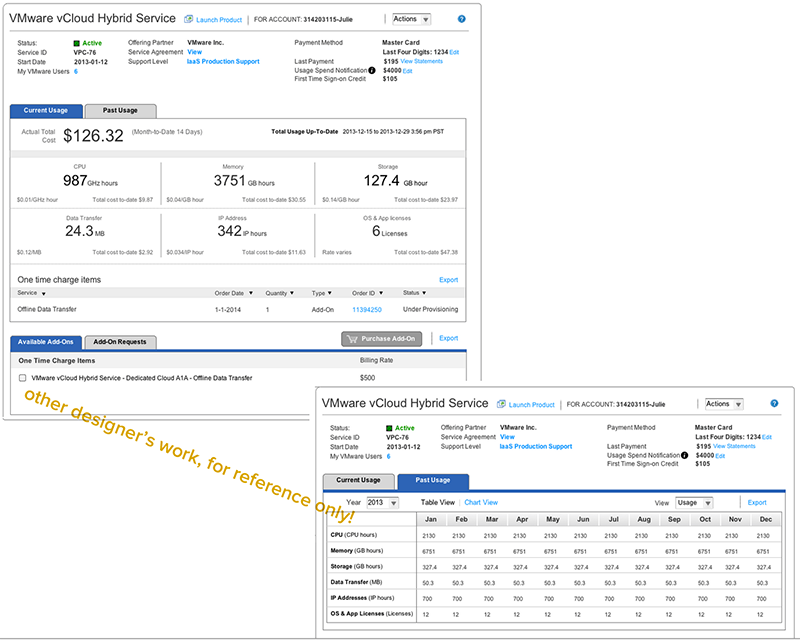
1This was where I started, a wireframe done by other designer, and all of the feedback from user study and PMs:
Hard to find actions
Dated design
Want to see spending trend
Need UI scalability to display more resources
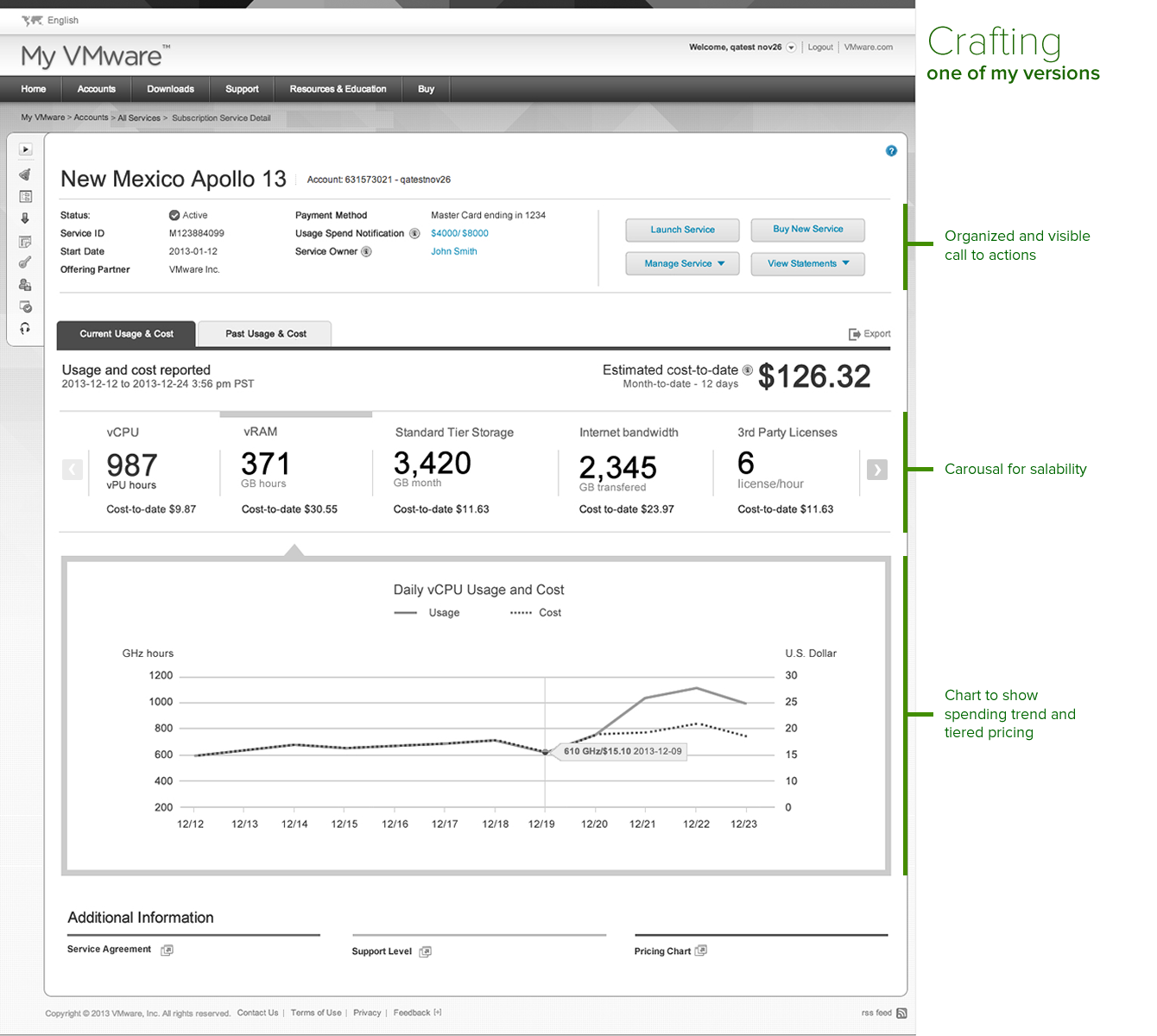
2So I started crafting the ideas: a commend center with clear call to action buttons, a carousal, which can display more in limited space and a line chart to show trending and the saving when tiered pricing kick in.
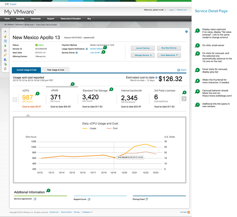
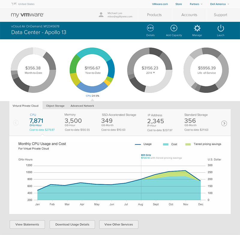
3After a few versions and revisions after talking to developers and PMs, I finalized it, I added in all of the details and all of the flows initiated from this page. I wrote annotations and submitted for development. I tested it as developers finishing coding. Make sure interactions and visuals are implemented as designed. This is live today, and the task complete rate is around 80%.
4But I didn't stop there. I started to ideate the next generation with the ideas and feedback I got from user testing and PMs:
Want to see all data without dig into the tabs
Don't need to see the service details all the time
Need to show the grouping of resources and be able to filter
Need to update the visual per latest trend and company's style guide